Jorus Website Revamp
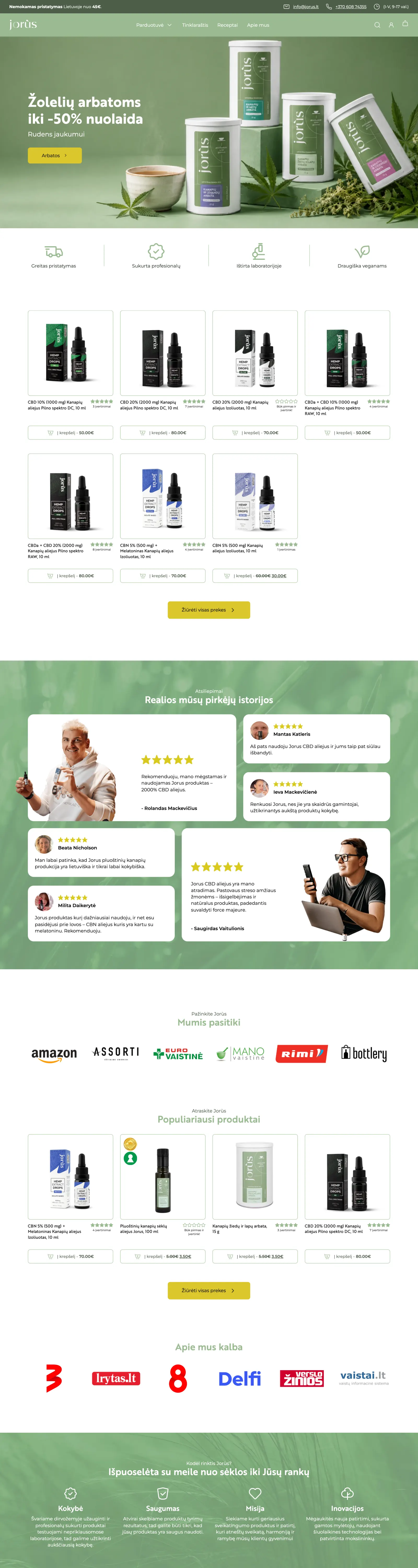
E-commerce redesign focused on cleaner UX and easier product discovery.
- Project Year
- 2025
- Services Delivered
- E-Commerce
- UX/UI Design
- WordPress Development
- Partner Website
- jorus.lt (opens in a new window)

jorus.lt
The challenge
Jorus came to us with an online store that had grown cluttered over time. Products were hard to find, the navigation had accumulated dead ends, and the checkout path asked more of shoppers than it needed to. The catalogue was sound; the experience around it was getting in the way of sales.
What we did
We rebuilt the store on WordPress with product discovery as the organising principle, then designed the interface around how people actually shop.
- Restructured the category and filtering system so shoppers reach the right product in fewer clicks
- Redesigned product and listing pages for clearer hierarchy and faster scanning
- Streamlined the cart and checkout flow to cut friction at the point of purchase
- Tightened the visual system for consistency across the storefront
The outcome
Jorus now has a store that reads cleanly on any device and lets customers move from landing to purchase without second-guessing. The catalogue is easier to browse, the path to checkout is shorter, and the team has a foundation that holds up as the product range grows.

Shall we work together?
A free 30-minute call with one of the founders. We discuss your project's goals and scope, and within two business days we send a free, no-obligation proposal.
Or write to us directly at hello@anemo.agency